Pie Charts in DI

To improve their scores in Data Interpretation, one must first and foremost focus on the Interpretation part of the Data Presented. Pie Charts is no exception, where one should firstly try to understand the implication of the Chart and what does it represent.

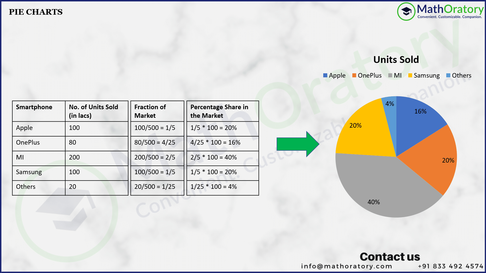
Pie Charts are used primarily to represent Market Shares, of any type. The Market Shares could be of:

  • Revenue of various companies
  • Revenue of various products of the same company
  • Units sold of various products
  • Customer share of companies of a particular product, etc.

Let us take an example to understand this better. Suppose, we have collected the data of the units of mobile phones sold of various companies in a particular geographical location. Let’s represent this data collected firstly in a table.

The Data Collected is represented in the table attached herein.

Basics of Pie Charts table

Now let us represent the same in a Pie Chart.

You will be able to observe that, first we have found the shares of the companies in percentages and then used those percentage values to draw the pie chart.

We can also represent the same using degrees.

It should be evident from the diagram that we have used the shares to find the degrees by multiplying each fraction to 360 degrees. Since, a circle (Pie Chart is after a circle) has a total of 360 degrees, the corresponding fractions should be fractional parts of 360 degrees.

Relationship with Ratios

Since, the Pie Charts are the fractional shares out of the total value (whatever that is in the context), it should be evident that it has a close relationship with ratios.

From the picture above, you can see that the Ratio of Actual Units is exactly same as the Ratio of the Degrees in the Pie Chart. This same will happen even if you use percentage values to represent the Pie Chart.

This is a VERY IMPORTANT UNDERSTANDING in Pie Charts. Whenever a Pie Chart is presented to you, it should immediately be evident to you that we can determine the ratio of the items used to draw the chart.

Video Explanation of the Basics of Pie Charts

Check the Videos Section in our website to watch more videos of our courses.
You can click here to Subscribe to our YouTube Channel to watch more videos on all topics tested in Aptitude tests.

If you need conceptual clarity on these things and looking for a structured course for the same, you can purchase our Data Interpretation Module by clicking here or the Full CAT Comprehensive course by clicking here. Trials are available!!!

Happy Learning,
Team MathOratory